|
|
| The principle of culture Jānis Borgs, Art Critic Children’s books of the publishing house Liels un mazs and the works of its illustrators | |
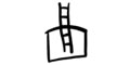
 Reinis Pētersons' illustrations for the poem by Ojārs Vācietis 'A Hole in the Moon'. 2008. Courtesy of the artist | |
| Evaluating the illustrations and visual format of children’s books is an extremely complex matter. Because for a grownup, childhood memories have faded and the viewpoint of the little person has become encrusted with the thick patina of life experience. So, on the one hand you have a child’s fresh perceptions, unclouded by assessments of ‘the right thing’, but on the other, the counterweight of educated wisdom. And now both of these aspects must be balanced. In order to test my currently held opinions, I try to recall my earliest memories. Obviously, neither artistic nor aesthetic considerations affected my childish delight in books; instead two other factors decided how good a picture book was. Firstly, there had to be realistic images and, in order to offer ‘lots to look at’, all sorts of wonderful details. Secondly, there had to be heartfelt sincerity. This would spark my imagination and I could then enhance the illustrations with my own embellishments. Thus, for instance, I had encountered all kinds of vivid monsters and ghouls in fairy tale books, and when my father took me to Riga Zoo for the first time, I trembled with anticipation and trepidation at the prospect of meeting the fairytale fiends in real life. After rushing past the elephant, the bear, the lion and the monkeys, we were already on the way home, but I sobbed bitterly at having missed out on seeing the greatest beast of all – the Devil. I was convinced that he just had to be in a cage somewhere near the goats, cows and bison. After all, he had horns too, and horse’s legs and a bovine tail to boot! My first encounter with the reality of adult fibbing that ensued produced screaming of epic proportions. So stories were just fantasies. Thus began my own participation in the world of lies. No less exciting were the regular meetings in books with “the famous duckling Tim” or Alberts Kronbergs’ moving drawings in Jērādiņa [‘Sheepskin’], Mazais ganiņš [‘The Little Shepherd’] and Treji kaķi [‘Three Cats’]. It was precisely the drawings therein that shaped a child’s soulful sensitivity and emotions, while Donald Duck for his part was so influential that I could completely identify with the bouncy Disney creation. And then along came Winnie the Pooh and Piglet. It turns out that childish enthusiasm can still be experienced in one’s mature years, and the mood improves only through the escapism of getting into the skin of Roger the Rabbit or the Grizzly Bear. My enthusiasm for children’s books continued throughout the 1960s, 70s and 80s, by which time I was already obtaining some artistic learning. But now the main criterion was the artistic value of the illustrations. Collecting children’s books became my hobby. Estonian publishers in particular excelled at Western-style modernism, and there were also splendid books from Poland, East Germany and Czechoslovakia. One of my favourites was the great Czech illustrator Adolf Born. Dizzy from the swings of such experiences, I sink into the doubts and reflections of the appraiser even now. | |
 Anete Melece's illustration in the poetry collection by Juris Kronbergs 'The Book of Clouds'. 2010. Courtesy of the artist | |
| I have in front of me a dozen works by four Latvian illustrators of children’s books: Reinis Pētersons, Edmunds Jansons, Anete Melece and Jānis Blanks – produced by the publishing house Liels un mazs since 2005. And while it may be a bit hasty to offer final conclusions already, as a ‘big kid’ my head is spinning with joy from these offerings. Our books are truly of the highest artistic and printing standards, and they meet the sacred criteria of giving children only the very best. The greatest satisfaction of all is provided by the fact that we have overcome the dominance of vulgar garishness, so evident elsewhere in the world. Although in Latvia, too, there is a rich supply of this pseudo-colourfulness, nevertheless we cannot, thank goodness, compete in this field with our eastern neighbours, for example. In Russia, book publishers treat children to feverishly hyped-up artistic “sweets”. The hit of visual “diabetes” is so powerful that someone who has grown up in our cultural tradition needs a hefty shot of insulin or a sip of wormwood tea to cope. But cultural tolerance probably requires the more neutral position of observer here as well. Каждому своë (Russian – Ed. note) – each to his own, as the saying goes. A number of “expert” studies have opined that children prefer this sort of ‘colourfulness’ and relate to it more easily. But doesn’t this place the child in the role of ‘cultural primate’, incapable of appreciating aesthetic nuances? It is worth remembering that they do, after all, accept almost everything offered to them by the adult world. If we stuff our children with potato crisps and cola, then we’ll raise them up to be slobs, while if we teach them an ascetic lifestyle – we’ll get Spartans. But the bringing up and education of children is not the subject under discussion here. The publishing house Liels un mazs and its artists show that another, both contemporary and intelligent, approach is possible. Numerically, the most productive of the artists has been Reinis Pētersons, contributing to five books. Three of them employ a technique characteristic of this publishing house, using handwriting for headings and occasionally blocks of text as well (Čingo Baba by Vizma Belševica, Mēnesim robs [‘A Hole in the Moon’] by Ojārs Vācietis, Mufa by Juris Zvirgzdiņš). This apparent ‘clumsiness’ actually works well with the illustrations, which are in some way reminiscent of a child’s drawings, however the evident ‘childishness’ is balanced out by the artistry of free brushstroke spontaneity. In places, the elegance of Pētersons’ drawings calls up associations with Chinese or Japanese calligraphy. In terms of such ‘safe hands’, I must highlight the monumentally convincing Mufa (designer – Ivs Zenne) published earlier this year, in which the temperamental masculinity of the drawings is sensitively intertwined with graphic finesse. This is a clearly set out and masterful work. Nor does this artist avoid using a fascinatingly magical black background (Čingo Baba and Mēnesim robs, again the designer is Ivs Zenne), thus emphasising the colours and enhancing the imagery with bright lighting effects. This explicitly overcomes our society’s prejudice against everything dark and black, stereotypically demonising it as the repository of negativity and depression. The aforementioned ‘childish style’ can be considered to be one of the trademarks of Liels un mazs, or could even be seen as a new school of Latvian book illustration, since it has been employed in no less than nine cases (!) out of the 12 books by the four artists. But while it has its attractions, there are some grounds for concern about a new orthodoxy being born, and in this light one might wish for greater diversity of artistic style, technique and expression. Another great creative success for Pētersons, in tandem with designer Ūna Laukmane, is Juris Zvirgzdiņš’s Lāča Bruņa medības [‘Bruno the Bear Goes Hunting’], perhaps the most heartfelt of the children’s books we are examining here. It is true that we can perceive in the drawings traces of the Winnie the Pooh aesthetic, always guaranteed to bring good results. Here also. However, the grey linen cover with the image of the big-eared bear is somehow so delightfully Latvian and rustic, that more sensitive souls could even be moved to a tear or two. This seemingly modest book not only warms the soul, but it reminds us of the acme of achievement in Latvian book publishing which is Miķelis Goppers’ publishing house Zelta Ābele. Here then is clear proof that children’s books have their place in this pantheon as well. | |
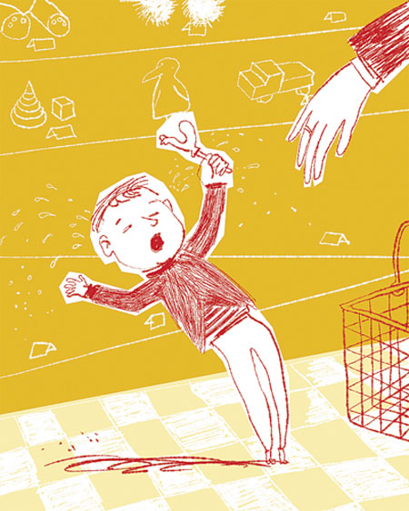 Edmunds Jansons' illustration for the poetry collection by Inese Zandere 'If you are a Piglet'. 2006. Courtesy of artist | |
| The qualities of the illustrations described above also apply to the works of Edmunds Jansons (in Inese Zandere’s poetry collections Limonāde, [‘Lemonade’], Brīnumbēbīša gads [‘Year of the Wonder Baby’] and Ja tu esi sivēns [‘If You are a Piglet’], as well as in ‘Teacher Jaap’ by Jacques Vriens. His “infantilism” has developed in the direction of cute ‘doodles’, which in this manner may bring the artist’s creativity closer to the drawing abilities and pleasure of any child. One would think that a certain educational effect may be thus achieved, that is by overcoming professional alienation, and as if demonstrating that everyone has talents that only need to be nurtured. Of all the books Jansons has worked on, Ja tu esi sivēns must be singled out for its particular artistic excellence. One wants to turn its pages again and again, to savour the various collage-like delicacies of colour and graphics the artist offers like a smorgasbord. With this accomplishment, the master seemingly vindicates the ‘childish style’ by showing that here also there are depths, seams and horizons of artistic expression yet to be discovered, and that there is still a great deal of life left in the concept. Artist Anete Melece (Maira Dobele’s Nepareizas dzīves skola [‘The School of Wrong Living’] and the poetry collection by Juris Kronbergs Mākoņu grāmata [‘The Book of Clouds’]) also presents some master-pieces. All of the compliments paid to the authors discussed thus far are also applicable to her. A common feature of Melece’s books is their intense intimacy. The artist is present here as the child’s friend: look, I’ll draw all manner of things for you, but you too can scribble something next to it... Her books are highly detailed, full of activity and with something new to discover every time you open them. It must be added that their expressiveness and artistry have an aesthetic quality and humour that could be addressed to both young and old, although there may be things there that a child may not fully comprehend... This author, too, has made an original contribution to creative accomplishment. The dust jacket of Nepareizas dzīves skola is decorated with cut-out title letters, backed by the reddish rosy tone of the hard cover. The highly unusual and complex printing feature gives this children’s book a playful attractiveness and a sense of spatial fun, and is another success for Liels un mazs. This work and all the other children’s books produced by the publishing house reveal a commitment to the highest quality of printing, sometimes, it seems – whatever the cost may be... But it is only right that children become accustomed, from a young age, to quality and things of value in all matters. And finally, a real bull’s eye for artistic achievement, brilliantly hit by Jānis Blanks’ illustrations for Aivars Neibarts’ Ola uz sola [‘Egg on the Bench’]. This is a small but gemlike masterpiece in every sense. The book retains the ‘naiveté’ cultivated by the publishing house, while managing to concentrate in it all of the best collectively developed expressions in this sphere, these tendencies blossoming and focussing as if under a magnifying glass. The hyperrealistic drawings are done in a refined palette of colour. Serious surrealist elements shine through the childish exterior, breaking the supposed barrier between the worlds of the child and the adult, and ensuring this work a proud place on the bookshelf of dad, mum or older sister or brother. If books continue to be such beautiful and substantial objects, we won’t need to worry about the invasion of the computer-internet-digital world for some time yet. The Liels un mazs publishing house and the artists it has gathered around it have transformed Latvian book publishing into an indispensable, forward-looking national cultural asset. A serious barrier of principle has been placed before the global tide of vulgarity. /Translator into English: Filips Birzulis/ | |
| go back | |