|
|
| Wrapped up in the cafe Maija Rudovska, Art Critic, Curator The Hanging Above. The Case in the Cafe series of solo exhibitions by Evita Vasiļjeva, Ieva Kraule and Darja Meļņikova at the Vita Kuben Gallery at Norrlands Operan in Umeå, Sweden | |
| A café is a good place to start a relationship. for discussion. for ideas. for the latest. for the moment. for introductions. for a reunion. it may be the most subtle and ephemeral place to be in the “here and now”. A year later, the café will already have been history and there’ll be something else in its place. the walls will have been repainted, lamps removed and tables taken away. only memories and stories or indentations on the walls will remain. When the vita kuben gallery invited us to create a series of exhibitions for spring 2014, we began with the idea of the café as an inviting place where the past and present meet. it’s quite a neutral and at the same time active place, in which the sometimes possibly impossible happens. We began with this quote, for which we can no longer find the origin: “Somewhere behind the plasterboard, a famous Soviet artist’s wall painting would be revealed. in it, the eyes of a rural beauty, created with swift strokes of the paintbrush, will have seen the juiciest episodes of the nightlife in riga. here, a well-known poet, tormented by demons, once tore his first poem into tiny pieces, which then fell at his feet like the first snowfall. An always honourable politician once threatened to kill a rival in the battle for the heart of the striking female pub owner. And an artist, well loved by the people, once quietly slid into a corner here and, undisturbed by the surrounding revelry, created a sketch for a masterpiece that now hangs on the wall at a museum. this scene, hidden from the eyes, was revealed purely due to someone’s carelessness or laziness.”1 And we continued with three episodes executed by latvian artists evita vasiļjeva, ieva kraule and darja meļņikova. the white cube of the vita kuben gallery, which can be found inside the umeå opera, norrlands operan, and “hangs” above its café, encouraged us to promote the presence of the café in the creation of the proposed exhibition. the white cube is like a clean, cold, impersonal, ideal environment for exhibiting art, in contrast to the café, which is packed full of various mixes, full of energy, sounds and smells. | |
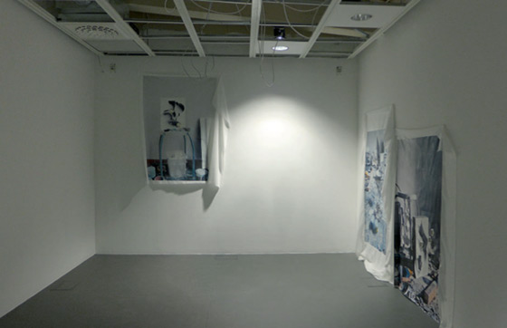
 View from Evita Vasiļjeva‘s Monograms exhibition. 2014 Photo: Vita Kuben Gallery Publicity photos Courtesy of the artist and kim? Contemporary Art Centre | |
| A part of evita vasiļjeva’s exhibition, Monograms (january 24 – february 22), was a model of a virtual space, a sketch that led the viewer into the dimensions of the space of vita kuben gallery and the café next to it. A three-dimensional sliding walk that examined the opera space and the gallery cube from all sides slowly prepared the viewer to think about dimensions, proportions, scale and form and then moved on to the canvases made by the artist. one of the most important issues with which vasiļjeva works is the quality of a space and its relationship with sculpture. the interplay of the video fragment with the space became a reference point for the entire exhibition, leading the viewer to thoughts about the presence of the space and its interaction with the objects within it. the canvases with images of sculptures set up in the gallery space, which were posed for the artist’s camera with her workshop as the background, were simultaneously both photographic (flat) as well as spatial, being located somewhere between different dimensions. Such an impression also arose because the canvases on which the images existed themselves became sculptures within the space. in a sense, there was kind of a matryoshka principle present here – the space (a real, physical gallery) in which spatial objects were found, in turn, portrayed a space with objects. the incorporation of one within another and its further repetition or interpretation. even though vasiļjeva’s works do not reflect on the Endless T-Shirt idea in a direct way, they definitely still approach and are influenced by currently fashionable internet art and memes.2 The image, its etymology and its further use in a contemporary art context was also an important part of ieva kraule’s solo exhibition ...if all you told was turned to gold (february 28 – April 5). influenced by Soviet-era publications and the grainy, poor-quality, black-and-white photographs published within them, kraule created a publication (an artist’s book) and objects for the exhibition’s framework. they became fragments and details that built up a certain emotional note, an attempt to perceive something that slowly and inescapably slides off into the past. As mentioned in the press release, images are the only “faces”3 that capture the inescapable changing times. they are full of sentimental and nostalgic feelings, even though the initial aim of their creation was most likely something completely different. kraule’s works communicated in a special way in the vita kuben space – the clay plates, which were influenced by applied art, and the blinds-type hangings contrasted with the gallery’s cold, impersonal walls and the arrogance of the white cube in the same way as the softly playful poetry in kraule’s video contrasted with the dryness and coolness of image, with which contemporary art is currently enamoured. | |
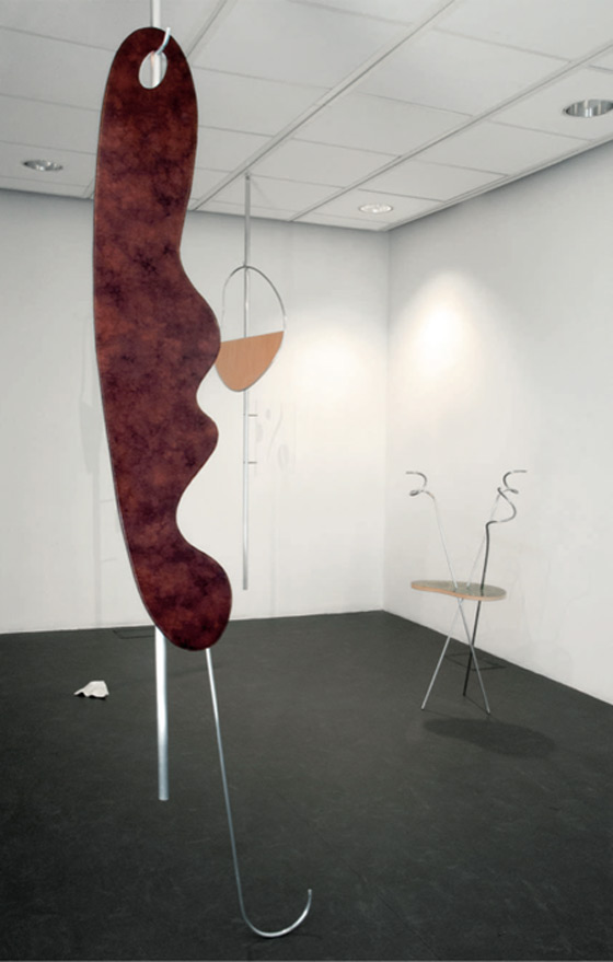
 View from Darja Meļņikova‘s Brewing Harmony exhibition. 2014 Photo: Helena Wikström Publicity photo Courtesy of the artist and kim? Contemporary Art Centre | |
| The last of the exhibitions in the series of three was darja meļņikova’s Brewing Harmony (April 11 – may 3). in this case the title is not just a play on words, because the word “harmony” played an important role in the exhibition. meļņikova focused on the cheap and light office and chain café interiors that became popular in the 1990s and continue to exist today. She was influenced by the aesthetics, colour combinations, materials and clichés that are used to create an attractive and home-like atmosphere. however, as we know, this “copy-paste” principle for interior design is like a trap; at first it seems inviting, but it has by then pulled you into the boring embrace of its standardised environment. meļņikova selected a number of elements characteristic of the aesthetics of these interiors and used them playfully in the exhibition hall. hanging them from the ceiling, an oasis of objects was created that whirled, sprung, hung and leaned, reflecting in its shadows and associatively creating a playground-type effect or a sort of Alice in Wonderland feeling. however, the materials and colour palette used (shining metal, light brown wooden tones, imitation marble, etc.) reminded one of the source of inspiration for the exhibition; even more, they brought to mind the monsters created by consumer culture that create everyday reality and the recognisable objects that are so light and easy to use. the strange, even slightly spooky objects seen in meļņikova’s exhibition became less unusual and no longer as threatening when their shadows, which contained images of coffee beans (similar to the ones used in the Costa Coffee brand), were spotted on the wall. we like to be wrapped up in things that radiate a cheap sparkle, because for a moment they seemingly offer everything that we want. “And what would happen if this wall were demolished?”4 we asked upon commencing this project. we expected something authentic, original and unprecedented from the café. we tried to take a look behind its double walls and bricked-up doors, to discern what had been lost. but, what if it transpired that there were no walls? then we have to come to terms with the existing, with the currently visible and experienceable, with the “here and now”. Translator into English: Uldis Brūns 1 This text was included in the exhibition’s press release. 2 "Memes" are part of the culture (an idea, meaning, way of behaving etc.) that is passed on from one generation to the next by way of imitation or appropriation. 3 In continuing to reflect and comment on Soviet-era culture, the opening of kraule’s exhibition was supplemented by kaspars groševs’ performance, which was influenced by the film Faces (1971). At that time the film served as educational material and portrayed 1970s Soviet youth – hippies, poets, musicians and others. in playing with its sound track, groševs added some of today’s mash-up culture, and then it no longer seemed important to know when and where the film had been made or what it was about; image and music work best at the specific moment and situation when they are shown/played. 4 This text was included in the exhibition’s press release. | |
| go back | |


