|
|
| Interpretation of fragmentary information Santa Mičule, Art critic Review of the More, More exhibition at Tabakas fabrika 09.06.–17.06.2014 | |
| It seems that with each year, the trend for exhibiting art students’ graduation works away from the Academy of Art building increases. they are being moved to public art spaces earlier, as if attempting to confirm that the works belong to serious art life as well as to shake off their immature aura. the positive side of this trend is the opportunity for the wider public to get to know the achievements of the newcomers. this situation, however, simultaneously places a higher standard and responsibility on the works, ones which are not included in the requirements for graduation from the teaching institutions. everyday visitors to exhibitions most likely have no idea about these, and they aren’t emphasised in the exhibitions’ informative materials, either. however, in the case of More More, it was hard to detach oneself from these associations with the diploma work format, because the typical expression of bachelor’s/ master’s works pervaded both the overall exposition as well as the structure of the individual works. this could be noticed most consistently in the descriptions of the works, where formal, stereotypical rhetoric, which neither clarified nor explained what the author was thinking, dominated. rather, attempts to legitimise what had been created as belonging to currently topical cultural contexts, directions, means of expression, etc. could be sensed, evidence for which was provided by the clumsy constructions of foreign words in the terminology used by the young artists trying to articulate “issues” and “goals” that were being activated in their works. the desire of the authors to position what was being exhibited as a solution to some specific challenge wove a certain didacticism into the exhibition and, yes, that same immaturity that restricted the opportunities for interpreting the works. with the awareness that the works on show in the exhibition were by graduates from a variety of the academy’s departments and courses, at first it seemed that the exhibition lacked detailed factual information about the department the artist was representing, what year he/she was born, who supervised the diploma work, etc. eventually, the viewer became accustomed to the uncertainty and minimal information; however, for many of the artists a broader indication of their artistic interests would have allowed viewers to more accurately perceive their intentions and the factors influencing the creation of their works (this is really only unnecessary for artists who have achieved a certain level of fame). | |
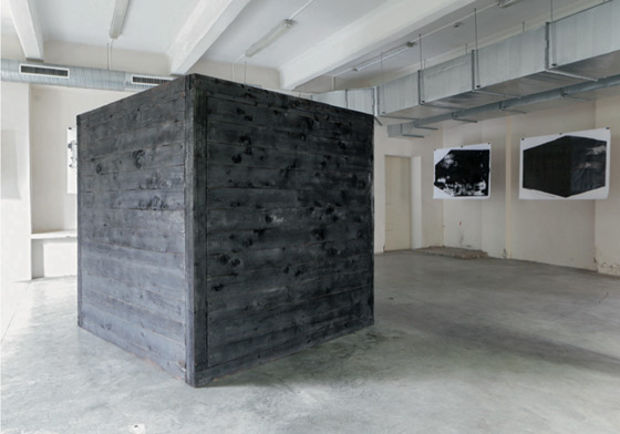
 Māra Drozdova. Comes and Doesn’t Go. Installation. 2014 Photo: Vents Āboltiņš Publicity photo Courtesy of the artist | |
| The exhibition’s artists were united in their use of diverse hybrid media, which can also be encountered more and more in other, so-called “younger generation” exhibitions: photographs, video, installations, drawings and object art in a wide variety of combinations. these are mainly media that allow the artists to manipulate with completed images and articles as well as to emphasise each individual’s subjective view on things rather than the “things” themselves. the designations found in the descriptions of the works also point to the popularity of this method: “set of versions”, “subjective structures”, “interpretation of fragmentary information”, “a new vision, a different form of feeling”, etc. Such formulations, in a way, cast doubt on reality and deny any sort of a priori self-evidence – the surrounding world gets deconstructed through doubts and alternatives, dividing up reality into fragments that aren’t even really connected even though they create a deceptive impression for the viewer that some sort of logical connection exists between them. At the formal level fragmentism was interwoven throughout the material construction of the works in the exhibition, too, and they were often divided into separate parts or stages. Significantly, physically whole objects, which we have become used to in traditional exhibitions dedicated to media art, weren’t found in the exhibition; in place of the strictly definable physical boundaries of objects, More, More offered the viewer a series of multimedia installations with a number of video screens, repetition of motifs, diversified images and spatial objects. in my opinion, the name of the exhibition gained its justification specifically in these attempts to expand; in place of a concentrated art image, preference was given to fragmentation, trying to materialise the idea of the work where possible into more and more diverse two- or three-dimensional units. the tendency toward fragmentation appeared in the work of nearly every participant in the exhibition and (most likely unintentionally) became the significant unifying aspect in the overall polyphony. there’s good reason why indriķis Ģelzis’ car that has been cut in half (or divided) was on show by the entrance to tabakas fabrika and could also be perceived as the most direct and visually most powerful manifestation of this method (even if it was by accident). The first thing that comes to mind upon seeing the achievements of the new generation of artists is a return to postmodern fragmentation. it functions not just as a formal method, but to a large degree it also clears up the point of the work, dividing it up into separate stages. in some cases these details blend successfully into a unified flow of images without losing their own value as individual objects. līga Spunde’s work Hopefully it Won’t be Irritating in Heaven seemed a convincing execution of a diffuse installation in which, just like in a majority of the works in More, More, the impulses of reality got deformed and encoded in a slightly absurd, comical style. Situations from the past, which the author invoked in the description, can’t be “read off”, but they obviously influenced the iconography of the installation. even though it was markedly abstract, Spunde’s visualised information was associatively powerful, to some degree being ironic about the practice of documentalism in contemporary art and doubting attempts to reflect about the past from today’s positions in a logical narrative way. | |
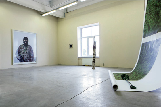
 Vents Āboltiņš. Front Row. Installation. Detail. 2014 Photo: Vents Āboltiņš Publicity photos Courtesy of the artist | |
| An interest in impressions left by the past and the points of contact between the past, present and future have also appeared in clever ways in Spunde’s previous projects,1 in which everyday situations have been transformed into her playground. for example, in her 2013 work Cyber bum she went around to computers that were accessible in public places and collated the files left in their recycle bins, which were heading for deletion. this slightly “trashy” kitsch aesthetic is a feature of the way that the artist documents the things taking place around her and recreates them within artistic structures; both symbols of modern consumer society as well as paradoxes of various everyday situations can be noticed within them. the wit and self-irony that becomes the main tone of her works is particularly satisfying; playfulness seems to be the basic emotional state of Spunde’s works. it was only for this, acutely lacking, feature in our art that i carefully noted the young artist’s name and i recommend that others do so as well. Similar motifs (the deformation of segments of time and objects dispersed in space) also appeared next to ieva kaula’s installation Memories of the Future. the work was basically an attempt to capture the flow of the world in a meditative, lingering aspect (“i was sitting on a chair, thinking about tomorrow, how i’d sit on this same chair and think about yesterday.”). clay became the main attribute of time-lessness, attracting the artist as a physical as well as a metaphysical material. She created and exhibited a variety of figures made of clay around the chairs. it should be emphasised that ceramic motifs have also been repeated in other works by kaula. references to powerful symbols, for example, the tower of babel or the sand clock, which imparted certain claims to the presence of spirituality in the work, appeared in the clay objects. kaula’s desire to approach unorthodox horizons of experience, to understand and see her surroundings (in this case the rural environment) as a meaningful “small screw” in the formation of the universe, could be sensed. visually, the fragmentary construction and use of multi-media and subjectivism is something the works had in common with the rest of the exhibition, but kaula’s attempts to embrace complicated non-material structures and searching imagery differed significantly from the rest of the exhibition participants’ groundedness and refuge in their closer surroundings. A conceptual understanding about art’s formal means of expression was offered in inga Ģibiete’s work Set, which was described as a three-dimensional drawing. the subjective forms laid out on the floor were formed from “non-artistic” industrial materials (plaster, sanitary silicon and pu foam) and widely-used everyday items (nylon stockings, balloons and shopping bags), through which the everyday and the trivial were brought into the art space. Such ready-made reminiscences, which can be observed quite regularly in the exhibitions of younger-generation artists, seem charming because they introduce a new dimension into the relationship between “life” and “art”, the formulation of which again requires the as yet undomesticated terms “recycled” or “trash art” to be used in the latvian language. the raw materials for the art involve the most trivial attributes of people’s everyday lives, which are at the same time direct consumer society lifestyle symbols, the transfer of which into imaginative forms would be artificial and not as effective. | |
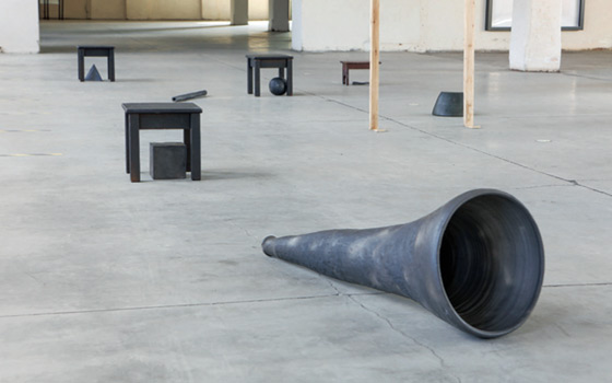
 Ieva Kaula. Memories of the Future. Installation. Detail. 2014 Photo: Vents Āboltiņš Publicity photo Courtesy of the artist | |
| The language of Ģibiete’s works is conceptually laconic, determined and precise, despite the fact that her method seems markedly experimental, playing around with randomness. compared to the other exhibition participants, Ģibiete’s extended art experience has allowed her to create convincing works. they don’t really belong to the category of “young” artists who are still only searching for their style and avoiding specific aesthetic positions, instead using visual cues to pose rhetorical questions that have no answers (Anna vanaga’s audio-visual installation Conversation seems to be a striking example of this avoidance). More, More aspired to combine the experiments of the young academy graduates in merging technology and media, with the subjectively polysemantic expression of technology aestheticisation and anti-narrative dominating. due to these circumstances, the works of those authors whose methods are different from the numerically dominating tendencies, for example, Artūrs lācis’ and lizete murovska’s animations or renāte miļūne’s Urban Solitude series of photographs, looked a little isolated against the background of the others. in contrast to other works in the exhibition, miļūne’s work contained existential moods and attempts to introduce broader generalisations of emotion through poetic, visually aestheticised photographs. photographs, redolent of urbane romance, served as an easily perceptible communication channel between the artist’s intention and the viewer’s experience. namely, it was easy to identify with the mood caught by the series, but, as mentioned before, these overly clear codes of communication seemed rather simplified and old-fashioned against the background of other works in the exhibition. An approach based more on metaphoric thinking could also be observed in māra drozdova’s Comes and Doesn’t Go series of works; the artist justified her technological experiments with the need to express emotional conditions and to subject the artistic material’s image to the logic of psychological processes. Each artist’s individual themes and range of solutions couldn’t be denied, which resulted in a many-voiced and diverse exhibition. however, a number of points of contact could be seen, through which one could define some common features. Apart from the fragmentism and the tendency to divide into separate parts, which was mentioned at the beginning of this essay, another conspicuous feature of the works in the exhibition was the introverted world of the works of art, a world estranged from the viewers, in which reflections on events going on in the outside world or any other contact with social life almost didn’t appear at all. the majority of the works in More More confirmed that reality is the main source of inspiration for the young artists, which was also emphasised in the introductory text to the exhibition: “in the exhibition, the artists describe their own attempts to understand the individual’s relationship with the world through the word vairāk (more).” the exhibited works visualised the contact points of this relationship, serving also as the fragile boundary between the internal and external world. the artists consistently stayed within their own private zones, almost without breaching the boundaries of emotional life at all. it was not things or processes that served as the main objects portrayed, but rather the way in which they were looked at within the framework of the art works; the ability to catch sight of and perceive became the main “product” the artist was able to offer the visitor to the exhibition. Translator into English: Uldis Brūns 1 See www.ligaspunde.lv/ | |
| go back | |


